Reinventing the user experience
Bipi —
Bipi is a mobility platform that offers a flexible car subscription service, allowing users to have access to a vehicle without the complications associated with traditional purchase or long-term leasing. Through Bipi, users can subscribe to a car on a monthly basis, choosing from a wide range of models and brands, with the option to switch vehicles, cancel, or modify the subscription at any time.

Understanding the company’s challenges
Bipi’s main problem his subscription process as this is not 100% digital, relying heavily on phone interactions. User flows and processes are complex to achieve and users give up as they don’t get to understand the brand’s differential value. Moreover, a lack of a consistent design system creates difficulties in maintaining scalability and visual coherence across the platform.
Our goals
01. Digitalize the subscription process
Design a fully digital process where users can complete their car subscription entirely through the platform, eliminating the need for phone calls.
02. Clearly communicate the value proposition through design
Improve usability and clearly communicate the value proposition to increase conversion rates.
03. Create a design system
Ensure scalability and visual and functional consistency while developing a strong, coherent, and recognizable brand image to boost customer engagement.
04. Improve the internal logistics platform
Optimize internal logistics and fleet management tools to enhance the overall service, improving customer satisfaction.

Getting to know our users
In addition to identifying the company’s challenges, a key factor in improving the website's usability was conducting in-depth user research.
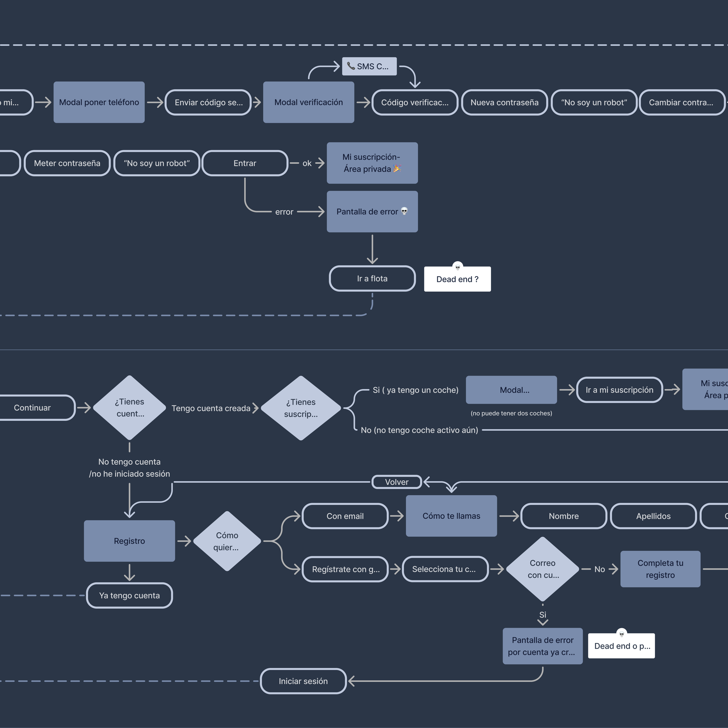
We developed a user persona and designed customer journeys for each process targeted for improvement. All user flows were mapped, including not only the happy paths but also potential dead ends and pain points that could hinder the user’s subscription experience. In addition we conducted an heuristic analysis and look for incoherences and incorrect use of the UI.
Research
01. User interviews and surveys
We interviewed real users during the car pick-up process to gather insights about their subscription experience. Additionally, we conducted several surveys to collect data on potential new features.
02. Heatmaps and clicks
We reviewed platform usage data to identify behavioral patterns and abandonment points. This allowed us to focus our efforts on the steps in the process that most needed improvement.
03. Data Analysis
We analyzed heatmaps, average time, funnel drop-offs, time spent on each screen, scroll behavior, text A/B results… to follow the user on his interaction with the web and to identify behavior patterns.
04. Behavioral Design
We consistently study potential biases that could hinder users. Our goal was to understand their fears, concerns, or insecurities that may impact their decision-making process.
05. Listening to callings
We used Aircall to gain a detailed understanding of users' most common questions and demands. This also helped us identify customer issues, allowing us to improve retention and increase loyalty
06. Opinions
We used Google and Trustpilot reviews to identify customer pain points and improvement opportunities by analyzing common complaints and positive feedback.

Creating the digital product
After identifying the main pain points, defining the user persona, and setting clear objectives, we began the design process to transform Bipi's digital experience. The website redesign focused on modernizing the brand identity, applying Behavioral Design principles to guide and facilitate user decision-making. Additionally, we significantly improved the onboarding process, making it more intuitive and efficient, which not only reinforces trust in the brand but also optimizes conversion and customer satisfaction.
01. Defining the user flows
We mapped out user current and future interactions to ensure seamless navigation.
02. Wireframing
We created basic layouts simulating the structure and placement of key elements.
03. Prototyping
We created a handoff design for stakeholder review and later development.
04. Testing and iteration
We tested the product with users and iterated based on data analysis.


Several achievements
PLP Header Redesign Drove 11% Conversion Boost
After redesigning the PLP header, an ABC test showed that variant C increased conversion by 11% compared to the original design.
Behavioral Design Sped Up Subscriptions on Funnel
Thanks to the application of behavioral design, we reduced the time required to complete the subscription process by more than half.
Average Ticket Increase: Users Added More KM and Decide Faster
The redesign of the pricing in the configurator resulted in over 20% of users adding extra kilometers to their subscriptions and making quicker decisions.